
Dashboard
Everything one click away

Fully custamizable
Easily join your preferred Table
Online gatherings
Meet friends, new people or teammates

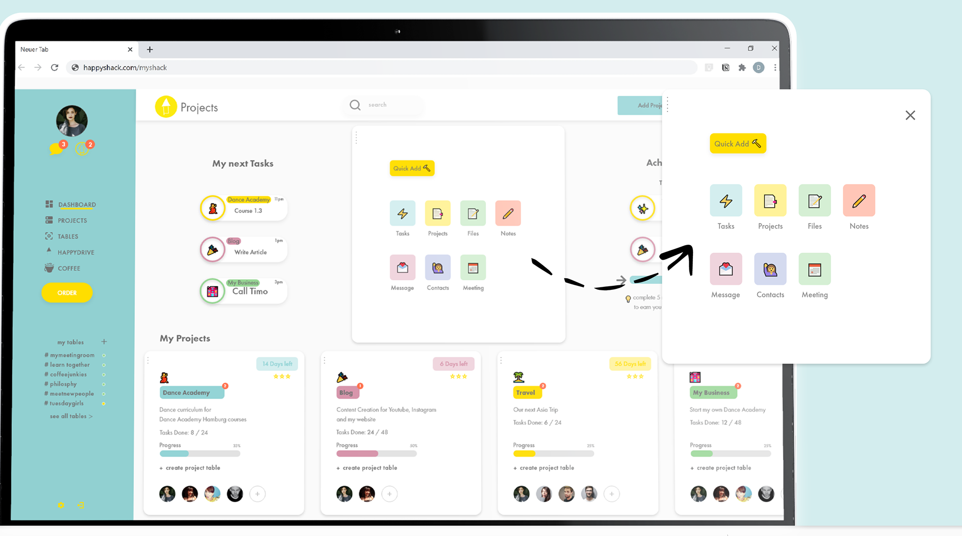
Projectmanagement
made simple and efficient
easy to manage information for various projects and collaborate with others.
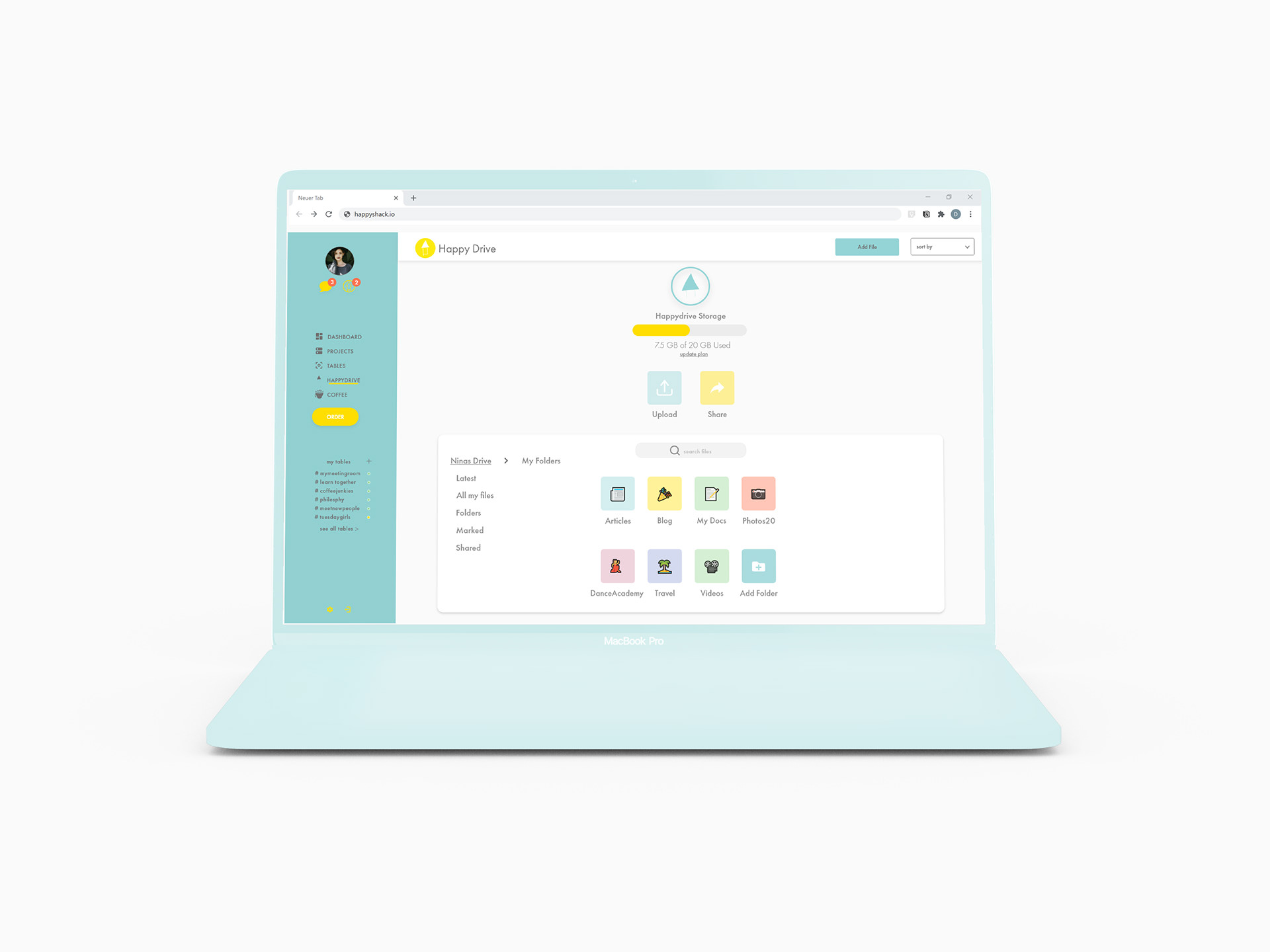
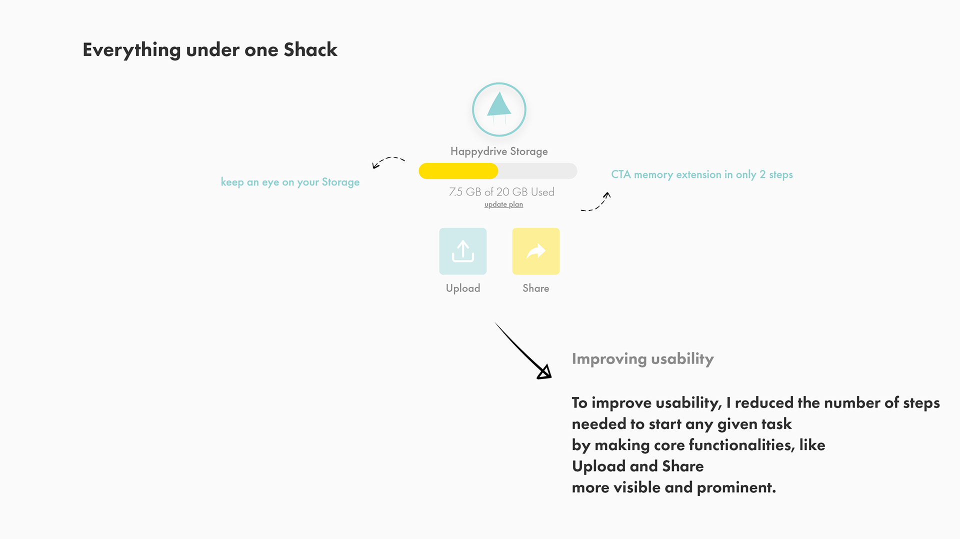
Everything under one Shack
A cloud based drive to give the users all the data and information they need into their fingertips
Type
My first big own Project in which I wanted to test my abilities
to come up with a solution for one of in my eyes big social Problems
How do we stay connected? How can we lead a social life in such times?
to come up with a solution for one of in my eyes big social Problems
How do we stay connected? How can we lead a social life in such times?
Duration
April 2020 till now (August still iterating) a UX Process never really ends
Deliverable
High-fidelity interactive prototype demonstrating key functionalities
My Roles
UX Designer & Product Manager
- User Research, UI Design, Visual Design, IA, Branding
Methods
User Research, Affinity Mapping, Experience Mapping,
Personas, User Journey, Information Architecture, Sitemap, Sketching, User Testings, Mid-fidelity Wireframe, High- fidelity Prototype
Personas, User Journey, Information Architecture, Sitemap, Sketching, User Testings, Mid-fidelity Wireframe, High- fidelity Prototype
Instruments/Tools
Surveymonkey, Flowmapp, Notion, Miro
Adobe XD, Figma, Adobe Illustrator, Adobe Photoshop, Adobe After Effects,
Adobe XD, Figma, Adobe Illustrator, Adobe Photoshop, Adobe After Effects,

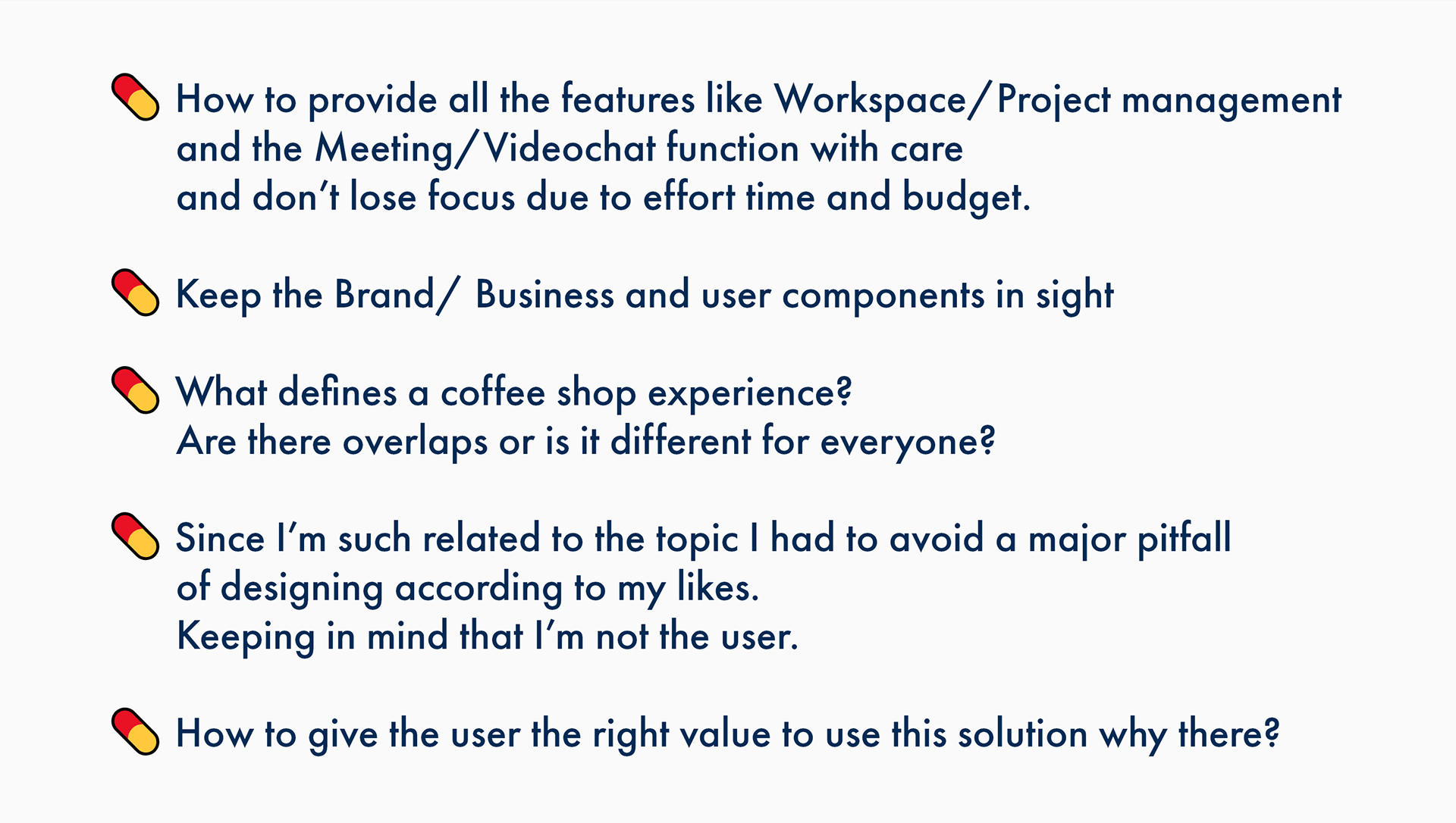
No more comfortable working in a coffee shop,no more social contacts.
I felt excluded from social life.
I felt excluded from social life.
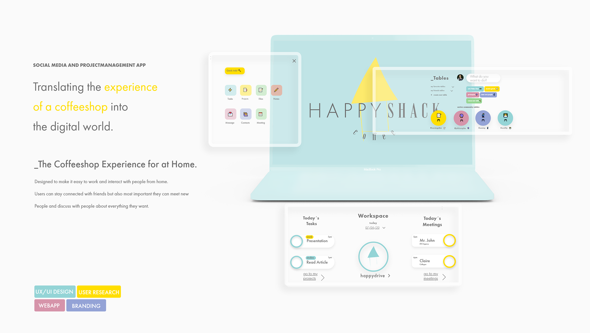
👉 How to translate the experience
of a coffeeshop visit into
the digital world?
of a coffeeshop visit into
the digital world?
One special and major facet about a coffee shop in my eyes is that many different people from different cultures and backgrounds come together and drink coffee, talk or work together.
I consider this to be an important aspect for general coexistence. By the omission of this meeting and contact point, the various points of contact were also omitted.
I consider this to be an important aspect for general coexistence. By the omission of this meeting and contact point, the various points of contact were also omitted.
I decided to do something about it.
🕵️But how?
How could I translate the experience of a coffee shop visit, of being among people, interacting with people, into something you can experience online at home?
What defines a coffee shop visit anyway?
I set to work and developed Happy Shack.
How could I translate the experience of a coffee shop visit, of being among people, interacting with people, into something you can experience online at home?
What defines a coffee shop visit anyway?
I set to work and developed Happy Shack.
☝️NOTE:
For the sake of clarity
in the following case study I'll talk about the offline experience as well as the online experience
For the sake of clarity
in the following case study I'll talk about the offline experience as well as the online experience
The offline experience is reffered to the physical visit of a coffee shop
The online experience is refered to making the offline experience digital/at home tangible

Happy Shack Logo

Happy Shack Logo Animation
Happy shack is the new place to be.
Better coffee. Better planet. Better us.
A new lifestyle experience- online and offline.
Creating a culture of warmth and belonging,
where everyone is welcome
and everyone stays connected.
✨The Coffeeshop experience for @ home.
Happy Shack is a Social media application and a project management system all in one.
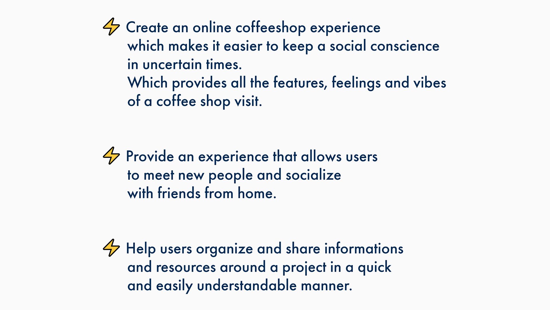
It`s been created to make it easy to work and interact with people from home.
Users can stay connected with friends but also most important they can meet new people and discuss with people about everything they want.
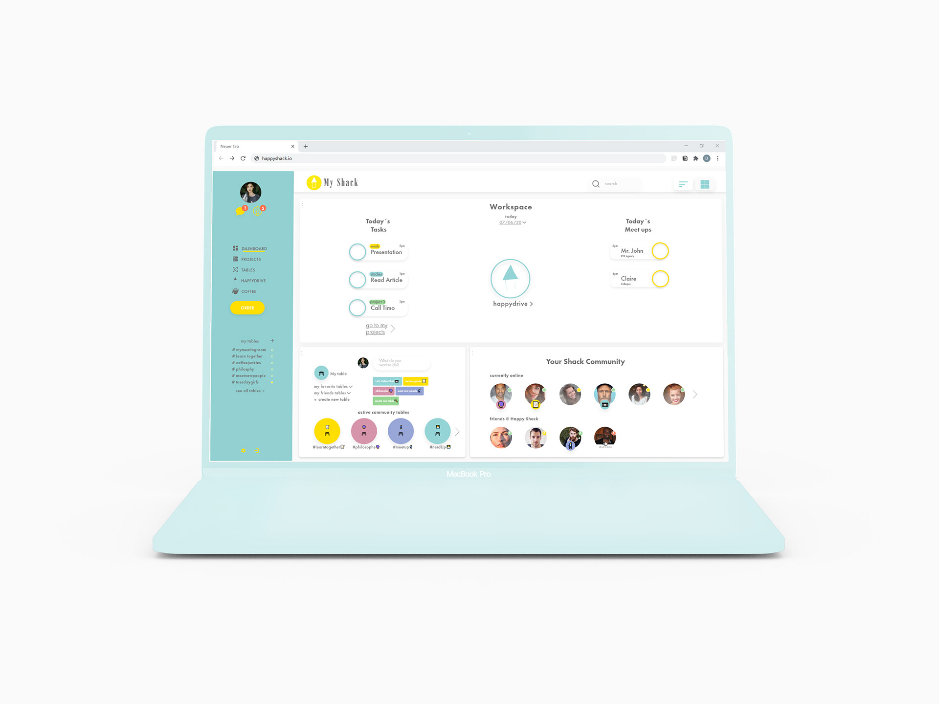
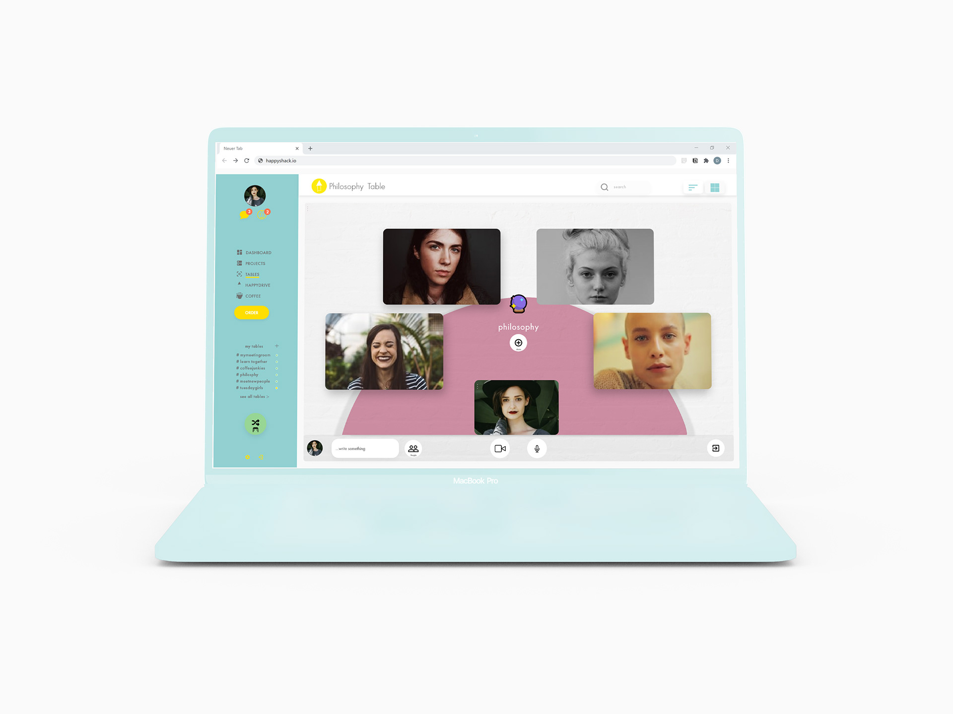
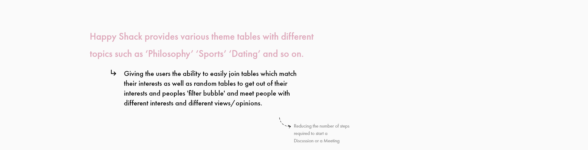
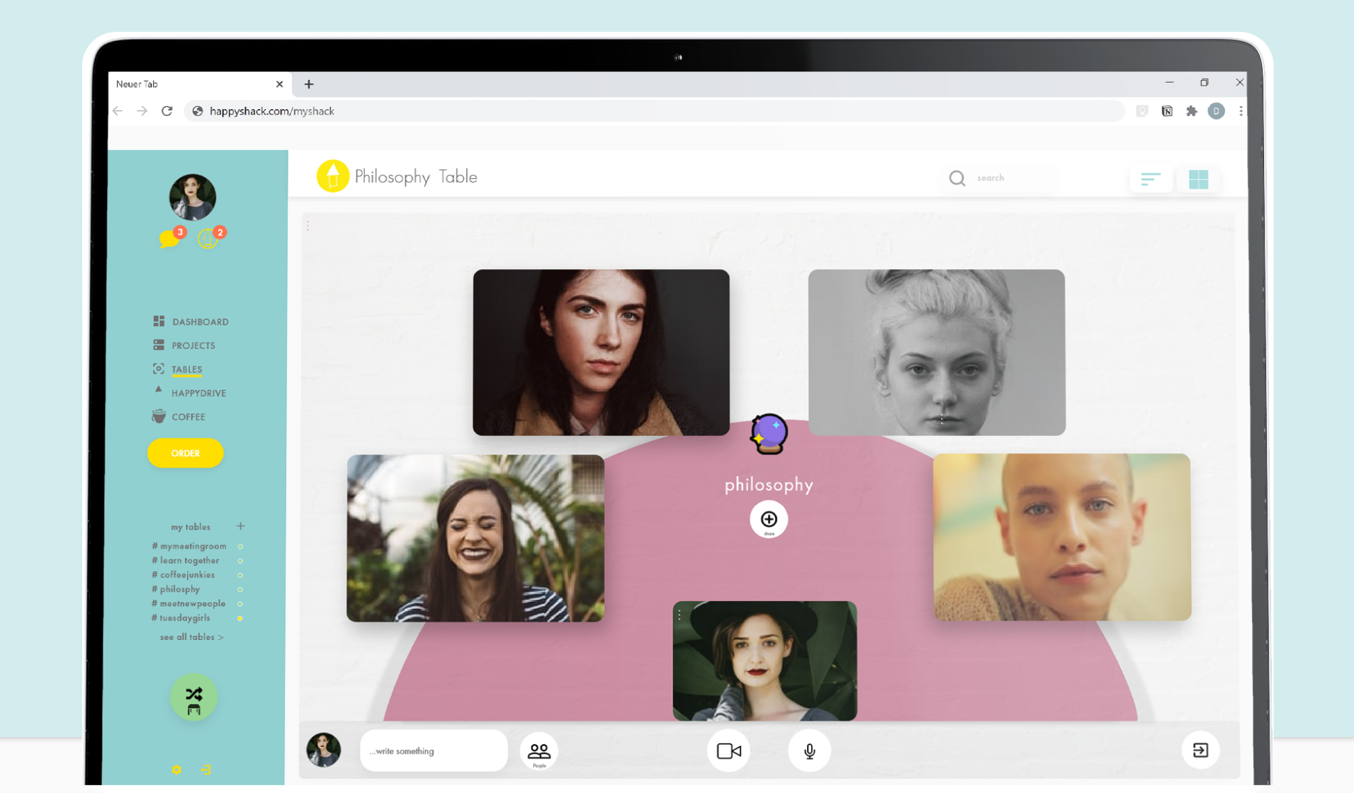
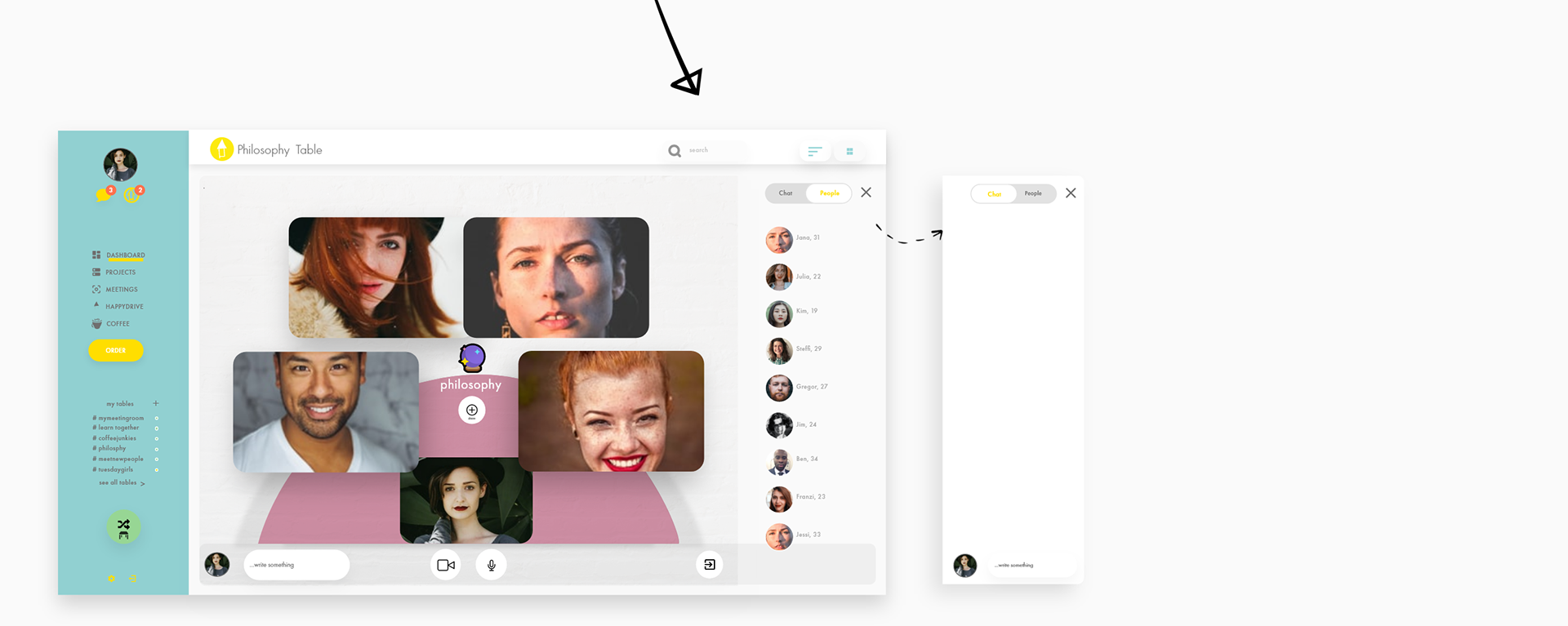
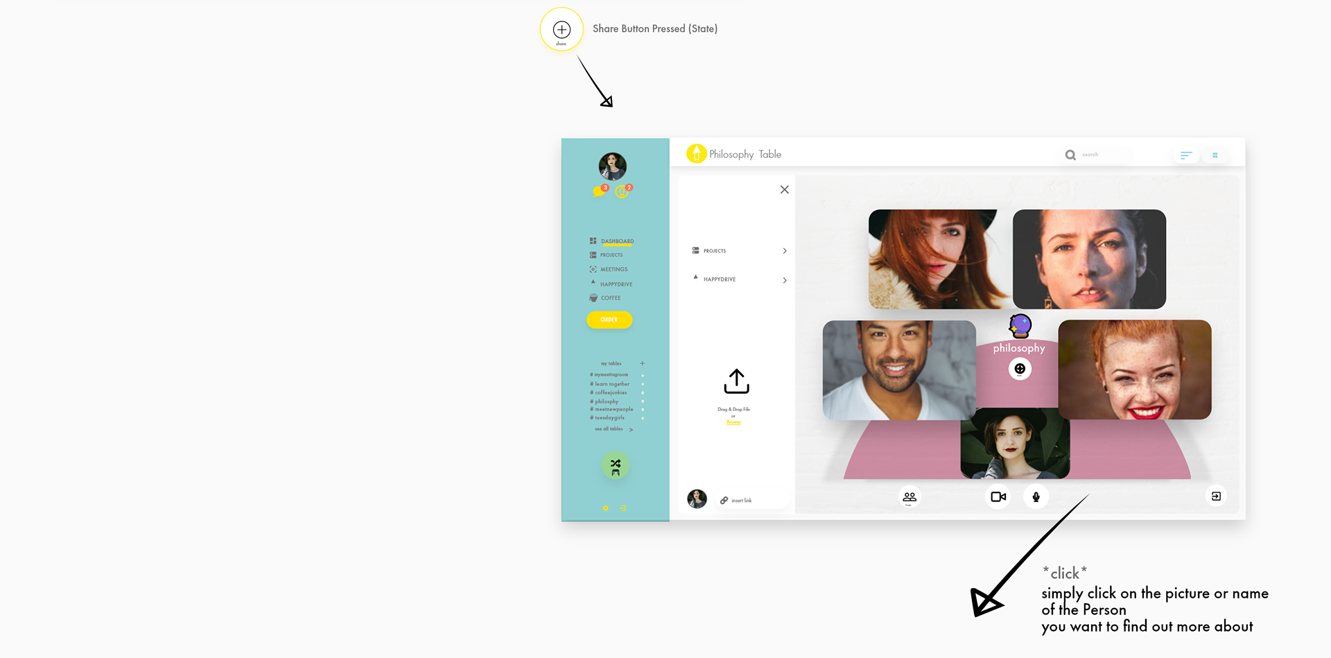
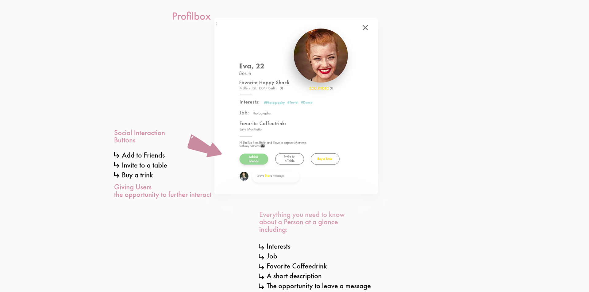
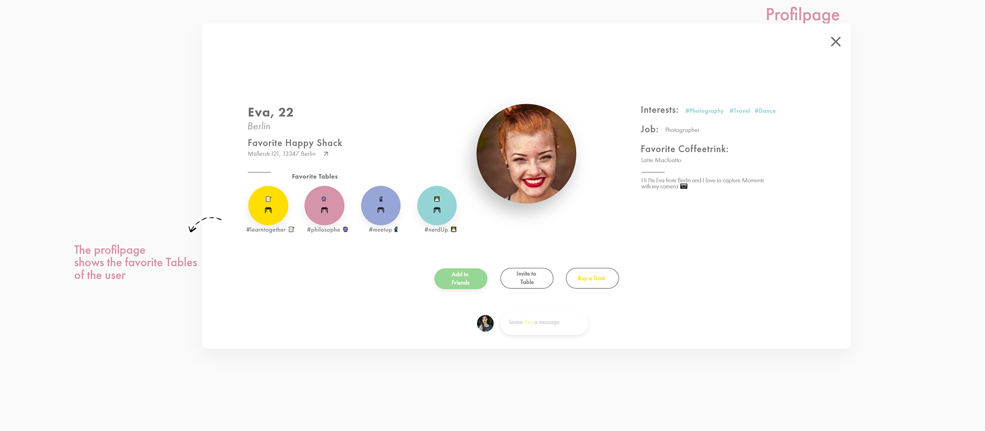
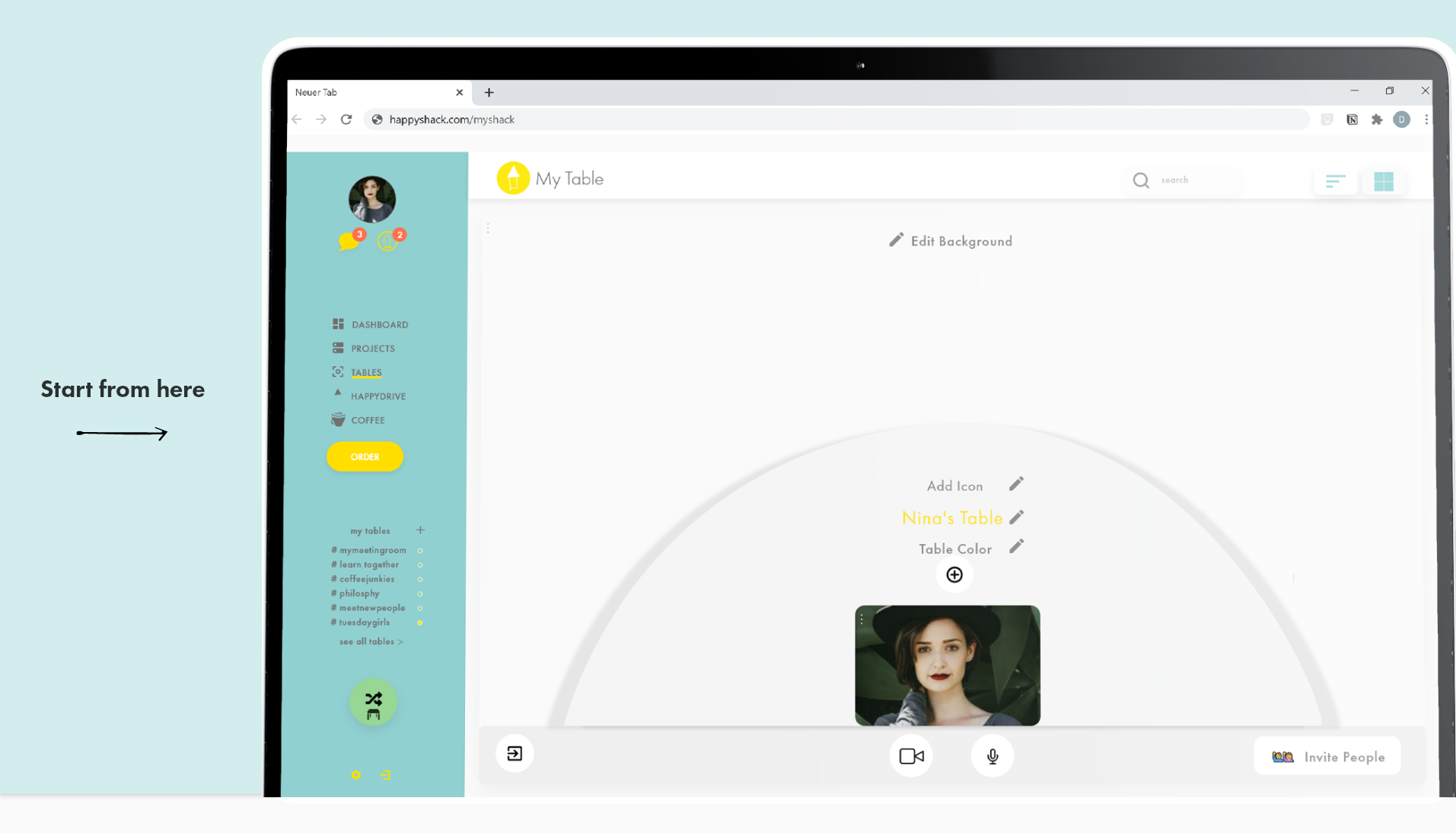
The core of this Application is the newly developed Meetup / Come together System called - tables.
It is designed according to a coffee shop structure with different tables the user can join as well as the possibility to design their own table and invite friends, teammates or new people to it.

In times where there is no more social exchange and cozy get-together, Happy Shack tries to provide an experience that allows users to meet new people and socialize with friends.
I worked mostly alone but I checked for feedback with my design peers and my mentor Anitha Kandasamy(Multimedia Artist) she helped me a lot in the conceptual phase and in developing the idea of an coffeeshop online experience and in the differentiated approach to the topic. She also kept the big picture in view and the view from outside.
See the final design iteration and deliverables at the end of the case study.

I followed a user-centered design process with a focus on qualitative data collection and analysis to extract rich design insights.
Specifically, I used Surveys, Empathy Mapping and Competitor Analysis to capture insights about
📍 Coffeeshop habits and the core motivations why you go to a coffee shop
📍 Current needs and frustration the users faces
📍 Users’ work performance - how they manage their projects and what factors impacted it.
I condensed the insights in key findings and derivatives. From these I developed first design goals and a rough roadmap.
I followed a rigorous design and feedback cycle to create a tangible user-experience which could support all the previously named and elaborated objectives for the end-users.
Each iteration was validated and improved on by user testing and critiques from my design peers and mentors.

My primary research goal was to understand why people go to a coffee shop and what is it that they love about it in order to be able to deduce what is fundamental for the translation into an online experience.
What makes a great coffee shop experience?
To determine this, I conducted a survey with 12 people to empathize what are the needs and frustrations of the users.
The participants were chosen because of their age and their interests. All participants were in the target group between 18 and 34 years.
To get the core essence of the coffeeshop experience right and to filter out the overlappings in the individual experiences of the participants
I asked questions related to:
📍 Motivations to visit a coffee shop,
📍 Social habits
📍 Influences through the Lockdown due to Covid-19
📍 Project and time management
📍 Coffeeshop must-haves
After also going through a secondary Research process where I conducted a better understanding of how project management systems work and how the generell coffeeshop visitors look in terms of demographics.
I came up with the Key Findings and the main User needs and frustrations.
The most important thing for all participants is the cozy people surrounded feel-good factor in a coffee shop.
It also became apparent that working and learning is one of the key factors why people visit a coffee shop.
“Let's meet for a coffee!”
Meeting with friends and being surrounded by people.
The survey I conducted showcased clearly the importance of the social aspect in a coffee shop visit.
“It`s the bar for at noon” - one participant said.
💡 Idea next project an online Bar experience:))
Based on this derivatives and key findings regarding the offline coffeeshop experience I had a better understanding and a better empathy towards the needs and the frustrations the users currently faces.
From the results I started to translate the offline experience into an online experience
How could this online experience look like?
Are there any advantages over the offline experience?
Can I even enhance the offline experience?
Whats on the market?
In addition to the user research, I looked up for similar products on the market which try to address the problem of translating an offline experience into an online experience and the recent lack of social interactions.
After long research I could not find a program or application that provides something similar.This encouraged me even more to keep on track and to find a solution for the problem.
It was clear that there is a need and a niche that I could fulfill with Happy Shack.
On my research I only found either project management systems or video chat apps.
As there is no similar product currently on the market I decided to investigate two kinds of products on the market.
📌 Project Management Applications
📌 Social Apps/ Video Chat Applications
Deliverables & Derivatives
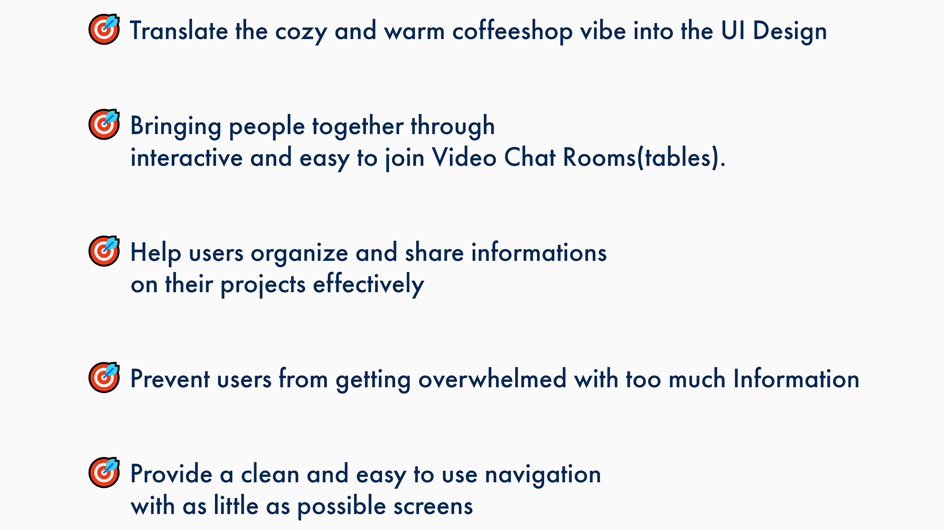
Evolved from the key findings of the research stage I developed Design Goals and possible ideas for solving the problems.
After I did take a closer look at the tagged data from the surveys, the secondary research and the competitor analysis I came across overlappings that emerged naturally.
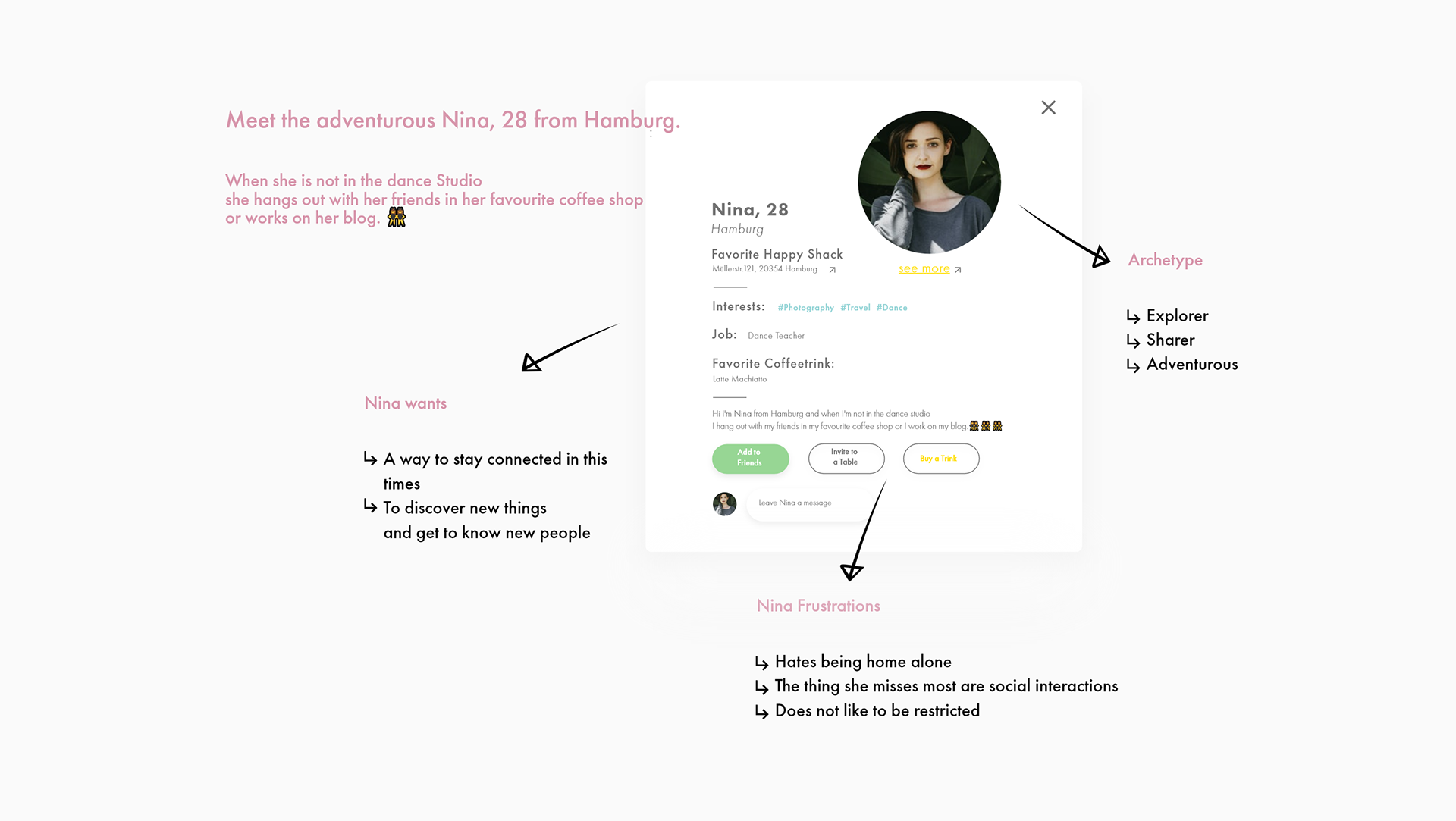
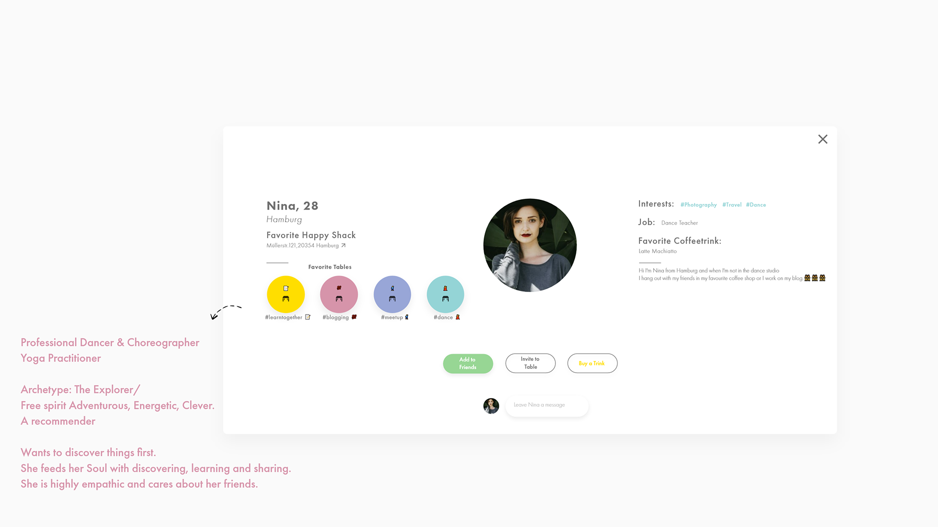
Due to the overlappings and trends shown I developed a Health and earth conscious On-The-Go Young Adult Persona called Nina
Meet the adventurous Nina, 28 from Hamburg.
I referred to her throughout the entire product development process. Every step I mate from here where with Nina's needs and frustrations in mind. How would Nina think about it would she enjoy it or even love it? Getting into her head wearing her shoes.
After my research and analysis it was clear which concrete components had to be included in the online coffeeshop experience:
🥳The Users want to have the ability to meet friends and to meet new people
🥳The Users wants the possibility to work on their projects as well as work together with friends or colleagues on projects

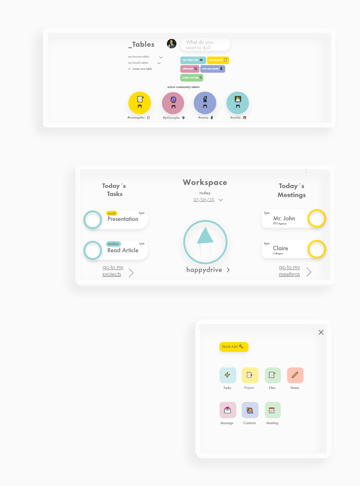
This led me to structure the webapp into 3 Parts:
Part 1Tables page
Social, meet friends and new people
Part 2
Projects page
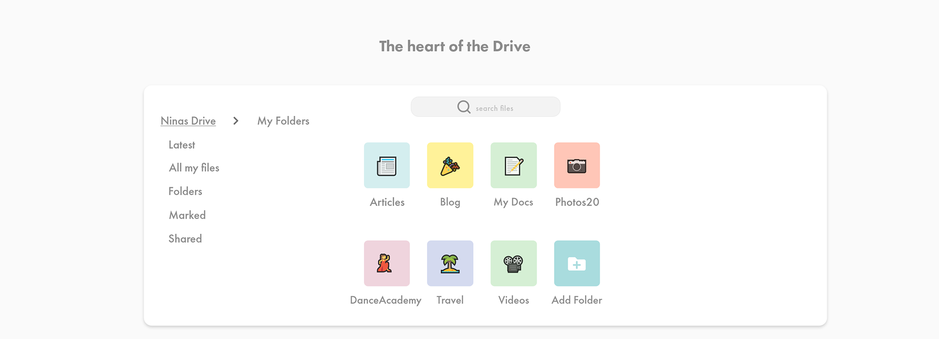
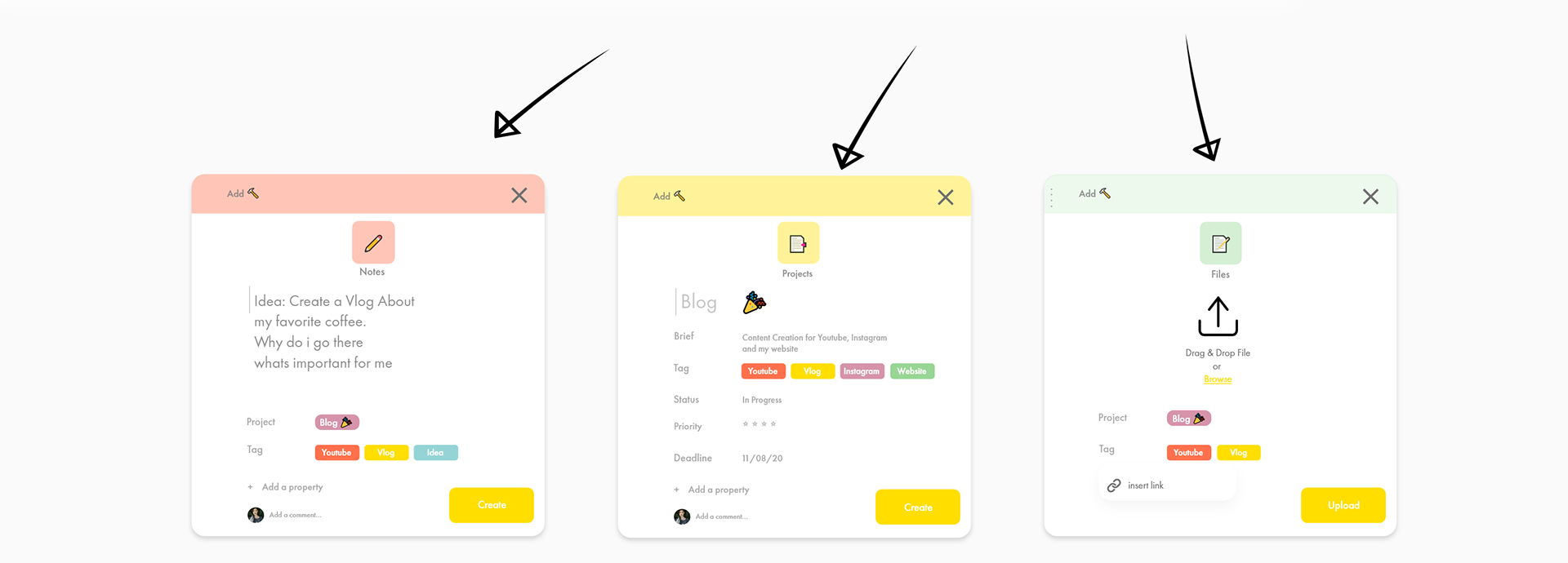
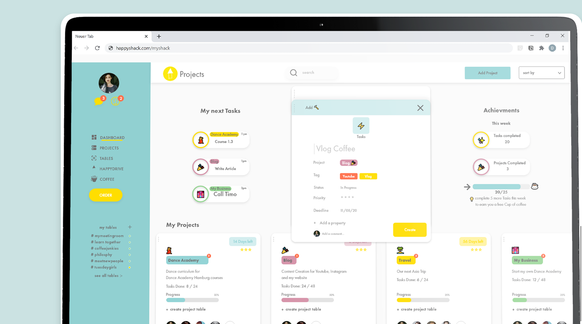
Projectmanagement which makes it easy to manage information for different projects and collaborate with others. Everything about a project — files, browser tabs, third-party applications, meetings and more.
Part 3
Happydrive
A cloud based drive to give the users all the data and information they need and want into their fingertips
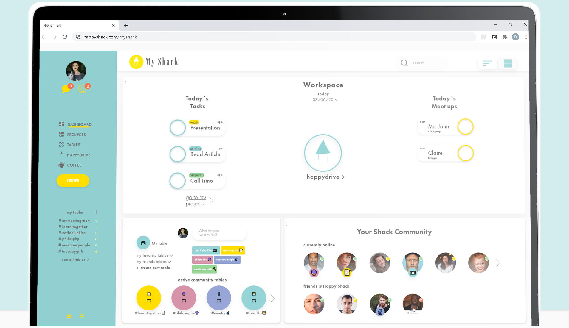
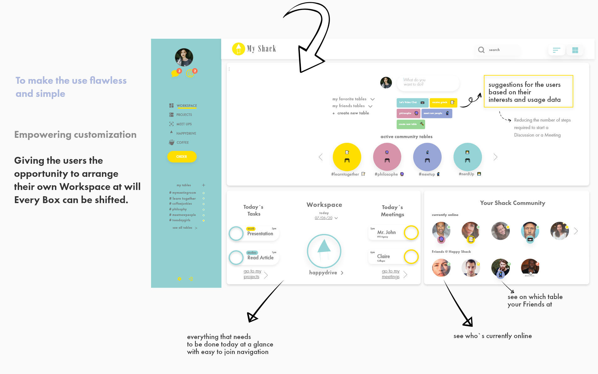
To make the use flawless and simple I decided to ensure that all pages can be joined and structured/ arranged through the dashboard called Workspace.
After I had the three main parts clear I set about building the fundamental structure of the product.
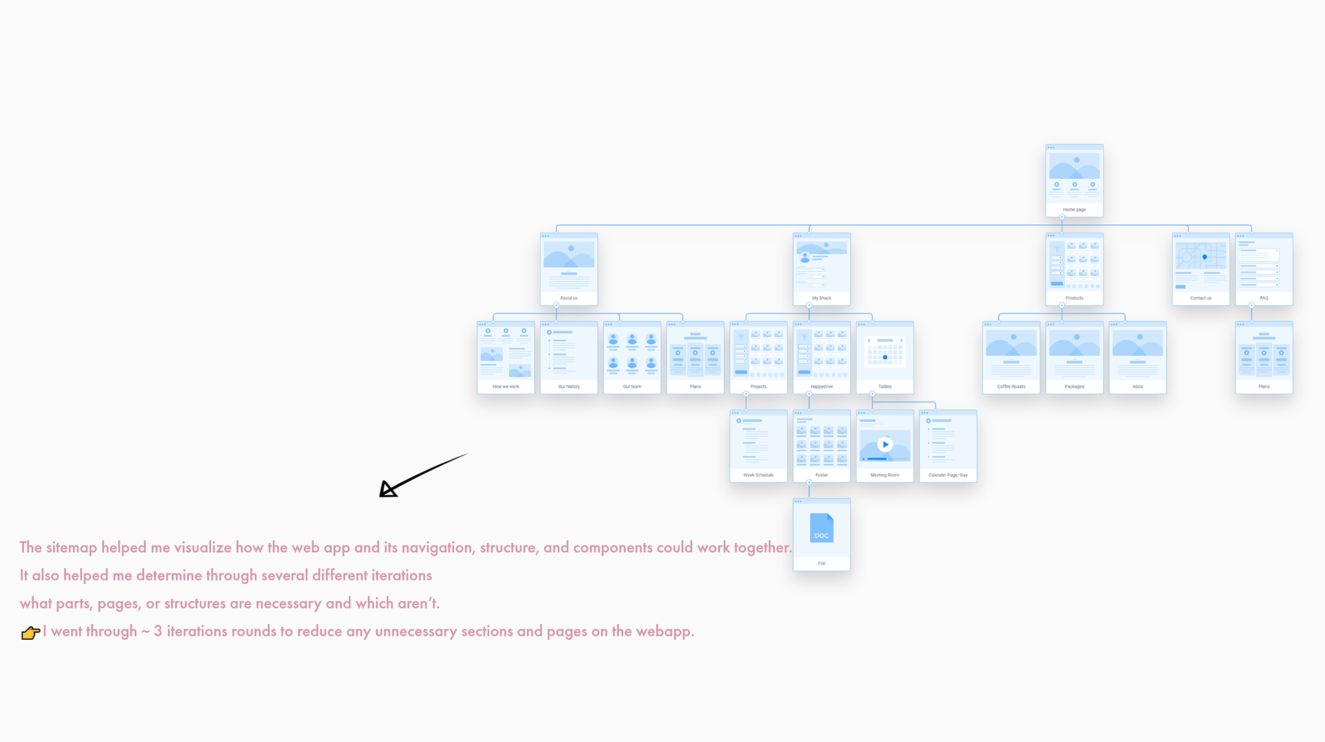
After the Information Architecture and the main components of the product where clear,
I did a User journey with Nina through the steps to uncover hinces of problems in the user experience she could face.
In this scenario, Nina is bored being stuck at home with hardly no social interactions. As she is a explorer and sharer type she comes across the new way of meeting people - Happy Shack and gets really excited. She decided to check it out.
Her main Goal is to meet new people and join a discussion she is interested in.
After the onboarding process she lands on her own workspace.
I decided to choose this main goal as it is in my eyes the most important feature in the whole application. Since I knew that this is the way most users choose to go, I wanted to find every obstacle, no matter how small, to improve their experience
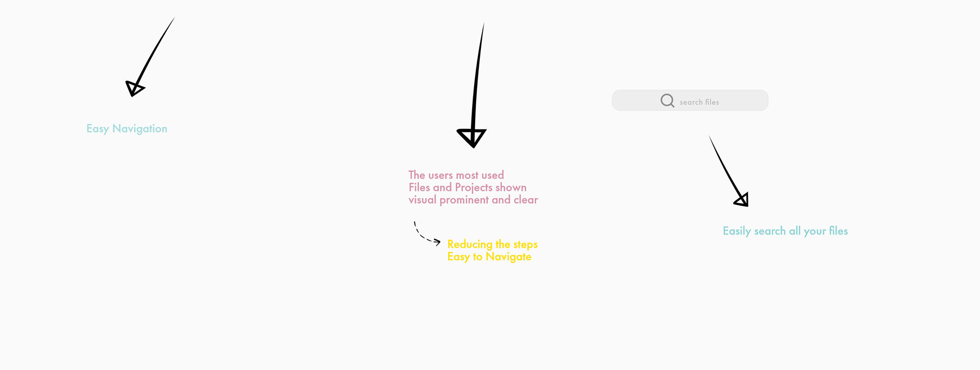
I mapped out the users’ steps to see how I could simplify their journey even more to their goal.
I discovered that especially for new users it is difficult to cope with the new system.
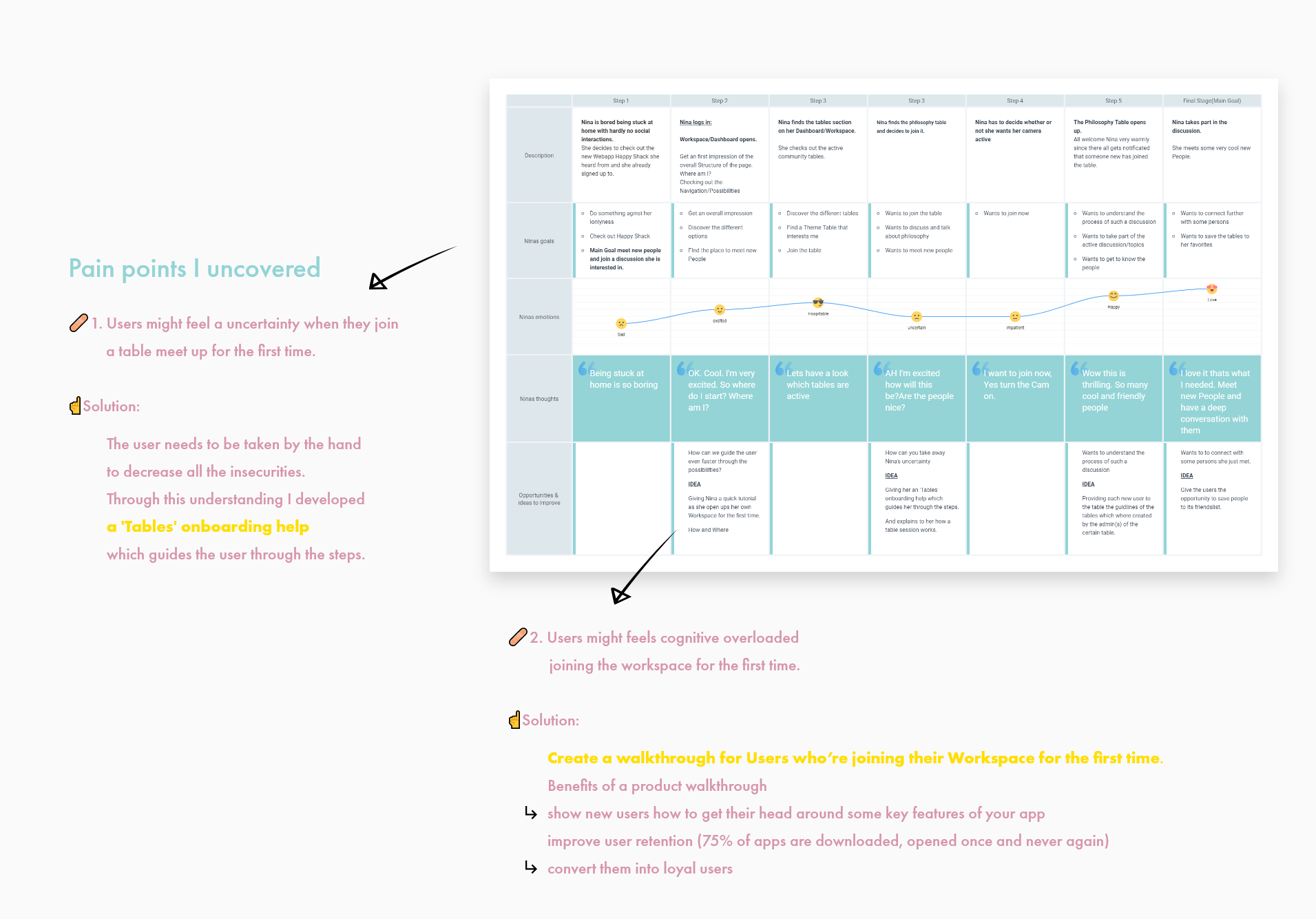
After understanding the user needs and the pain points. It was time to jump into the iteration phase.
But how do I put all the information in an appealing and clear interface?
Through rapid sketching, I generated multiple potential design solutions to each of the pain points.
Starting the creation process was very fun and it was a relief to finally give free rein to all ideas and thoughts.
I’ve used first the good old pen & paper and switched than over to sketch with touch
in concepts- an app with infinite canvas which I can highly recommend.
In my first sketches i tried to develop the possible structure
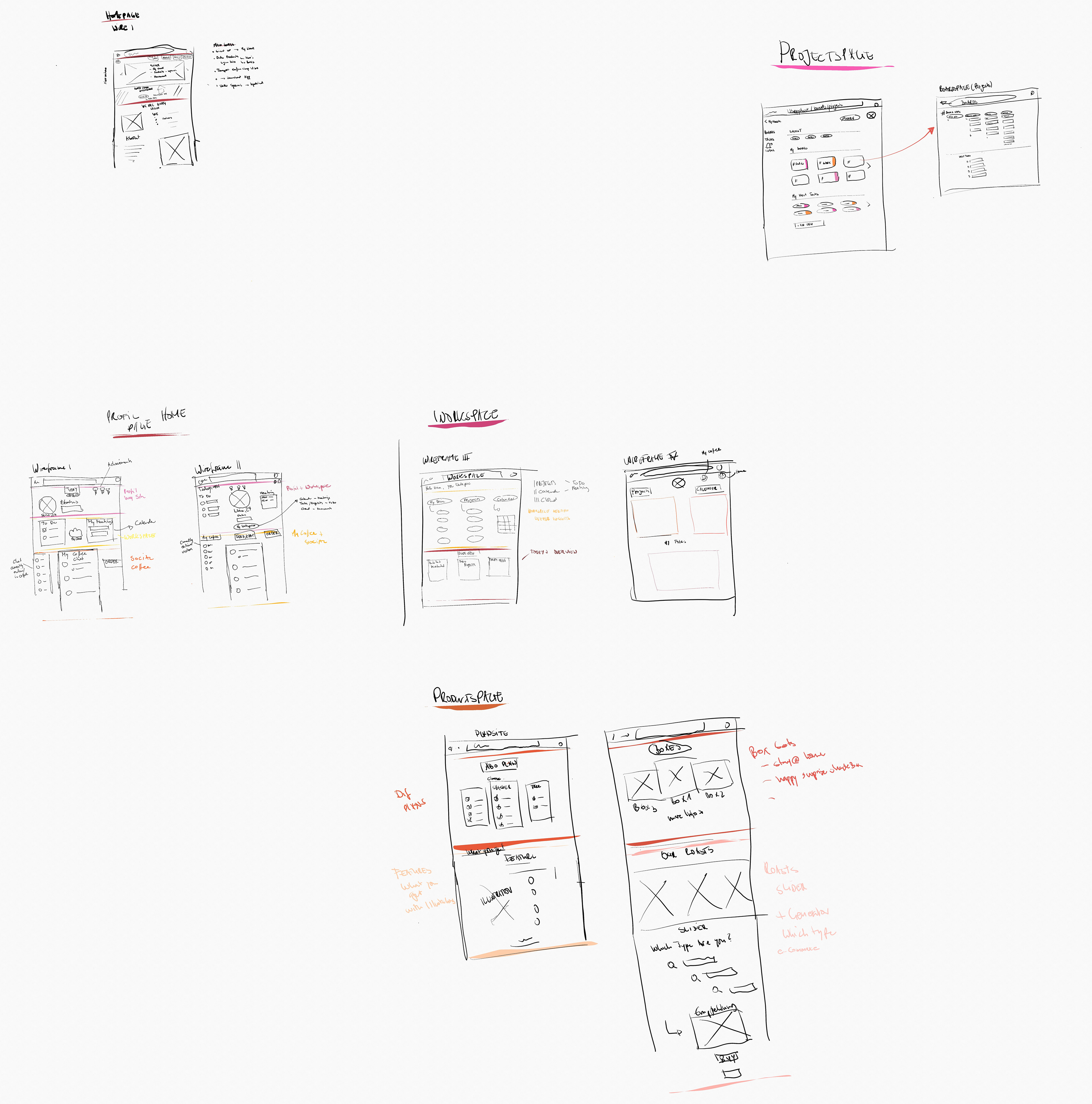
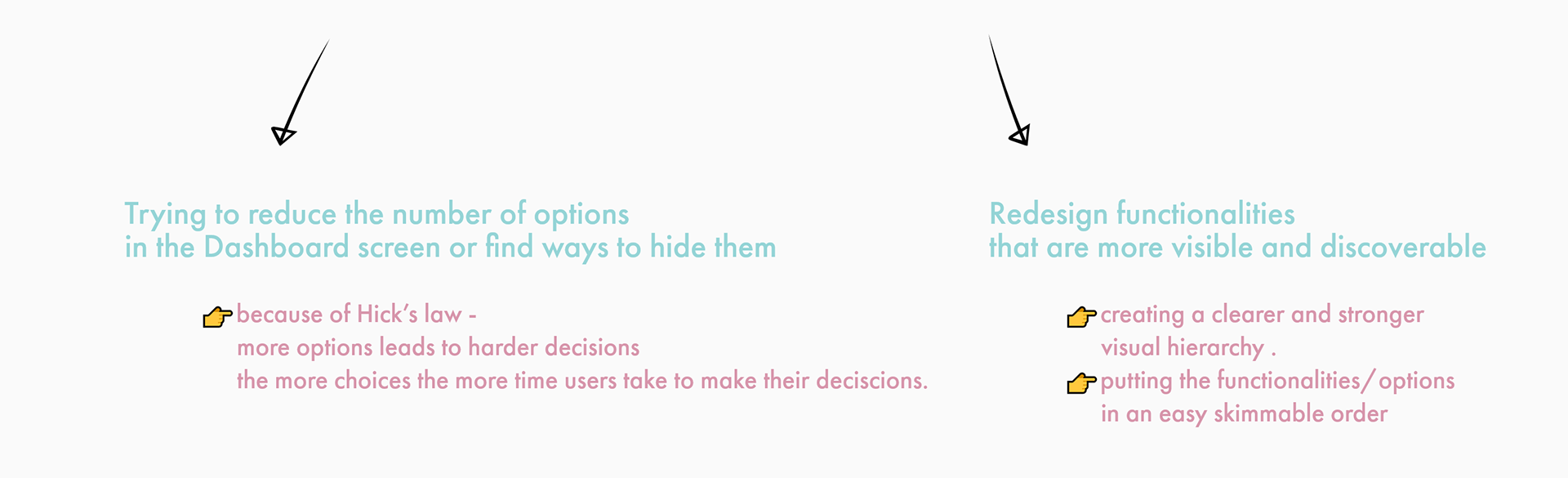
The first wireframes/sketches made clear that
I should limit myself to a one page webapp, to keep the cognitive load as low as possible for the users otherwise the user loses the overview of all functions by scrolling.
After a few iterations I came up with this wireframe
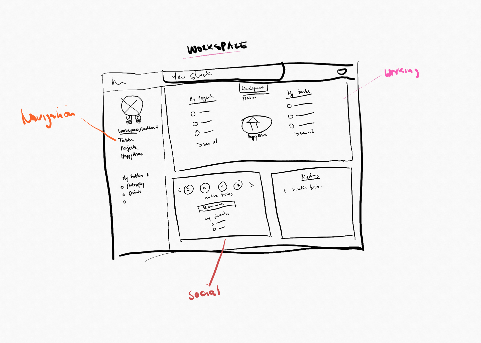
All Informations and features at one glance and easy to join with a left hand navigation panel and a centre stage which provides all the needed functions.
I decided to stick on this structure to go further in the process developing first user flows and conducting first user testings.

In order to concentrate more on the different steps and paths a user will take in the product, I started to map out user flows of different use cases and carried out the first user testings.
I defined three main use cases:
🥇Join a Meeting/Table
🥈Manage and create a project
🥉Set up tasks for the project.
to look at some UX metrics like
📊 Time On Task (TOT)
📊 NPS (Net Promoter Score)
📊 Task Success Rate (TRS)
This helped me identify and define the problems, pain-points, and improvements that could be redesigned in the next iteration step to enhance user experiences in reaching their end-goal.
Based on the user flow and the gathered insights and observations from the User testings which i carried out with one person very similar to my Persona Nina.
I evolved several solutions to improve its current user experiences by:

Introducing a newly designed product, website, and brand identity to create a cohesive and delightful user experience.
The Translation of the offline event into an online experience
I came up with solutions based on research analysis and basic design principles to create a proper layout structure with hierarchy, usability, accessibility in mind.
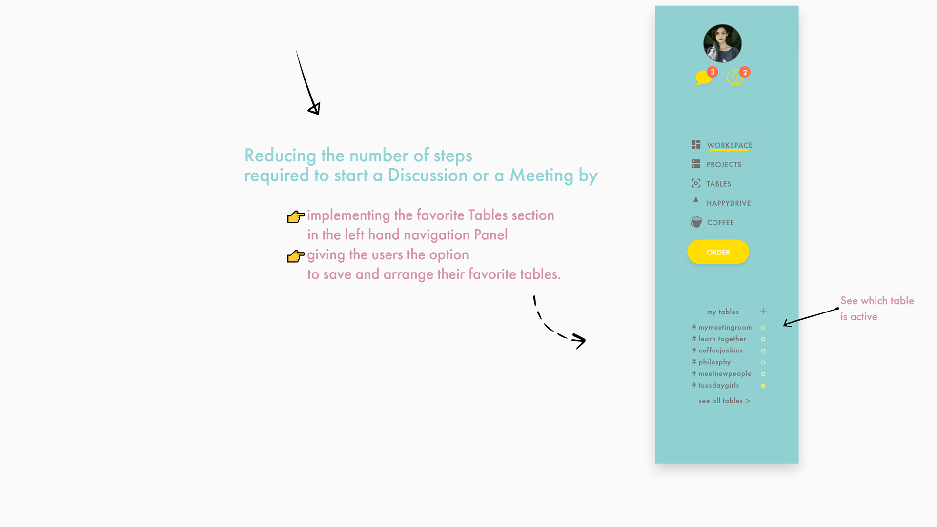
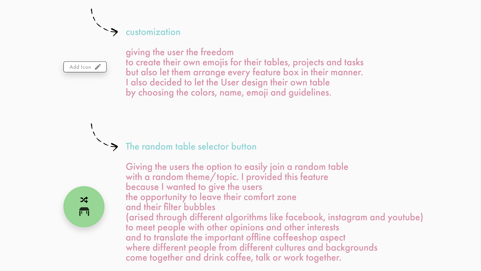
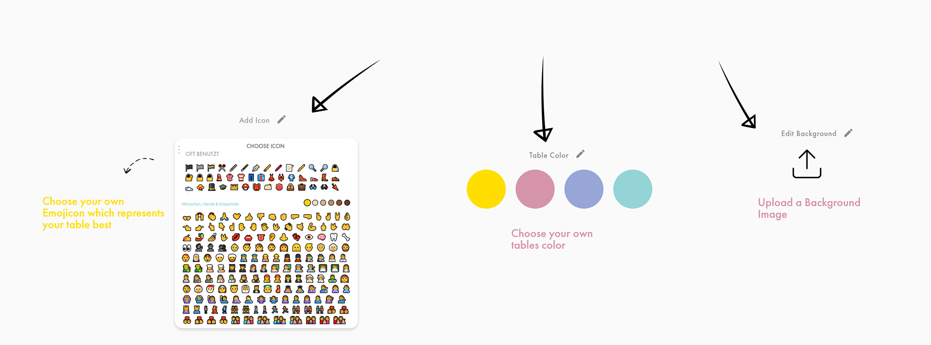
Empowering customization
To further optimize the user experience and to increase user engagement with the design, I’ve improved several significant problems which have emerged from user testing research and the previous iteration phases by incorporating multiple different features to help strengthen and enhance the product’s usability.
Features
Incorporating brand and consistency
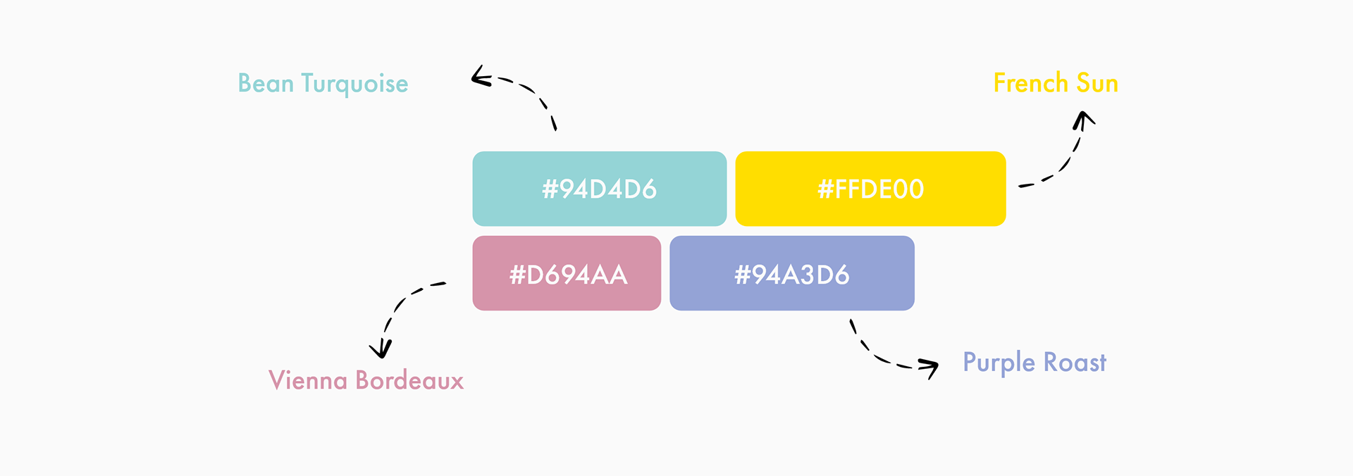
Branding was essential in forming a online coffeeshop experience based on the deliverables from the user research stage I decided to go with warm and cozy colors as it helps create an environment of trust, familiarity, and recognition towards users.
Consistency was another vital aspect of ensuring that all assets, colors, logos, and icons are consistent in order to bring delightful experiences to users.
Introducing the heart 💗 of the application
The Workspace/ Dashboard
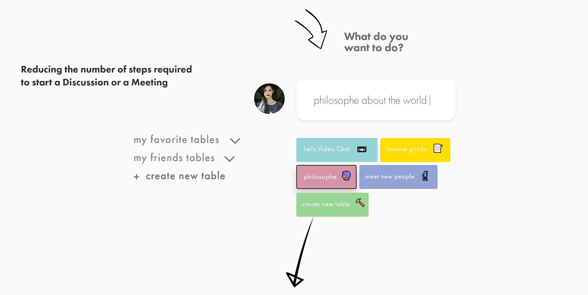


Joining the Table
meet friends and new people 🙋
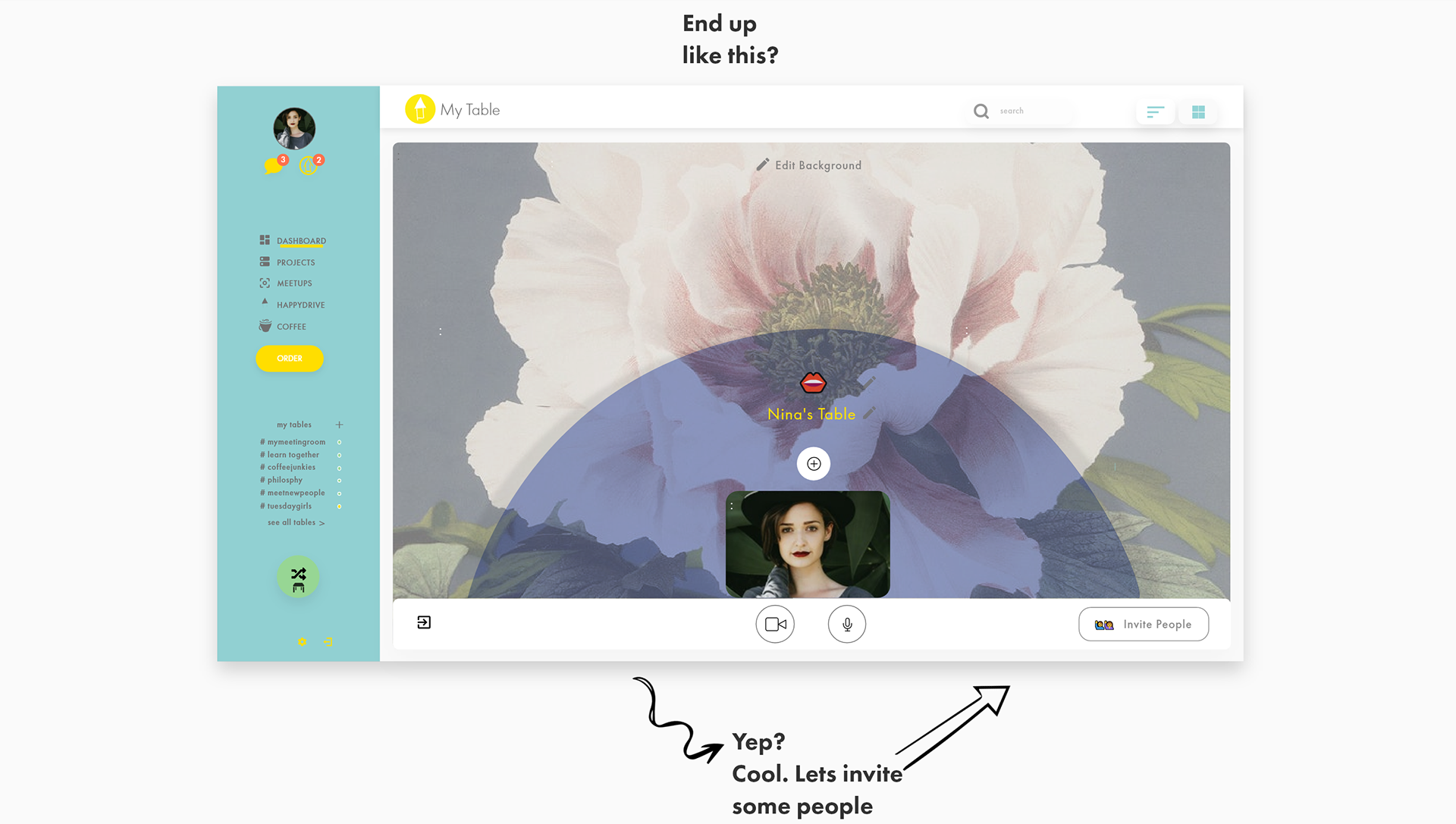
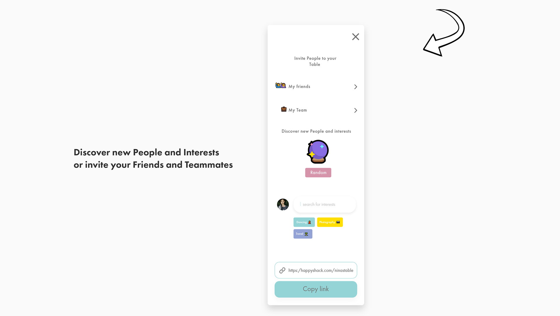
Want to create your own table?
Allright.

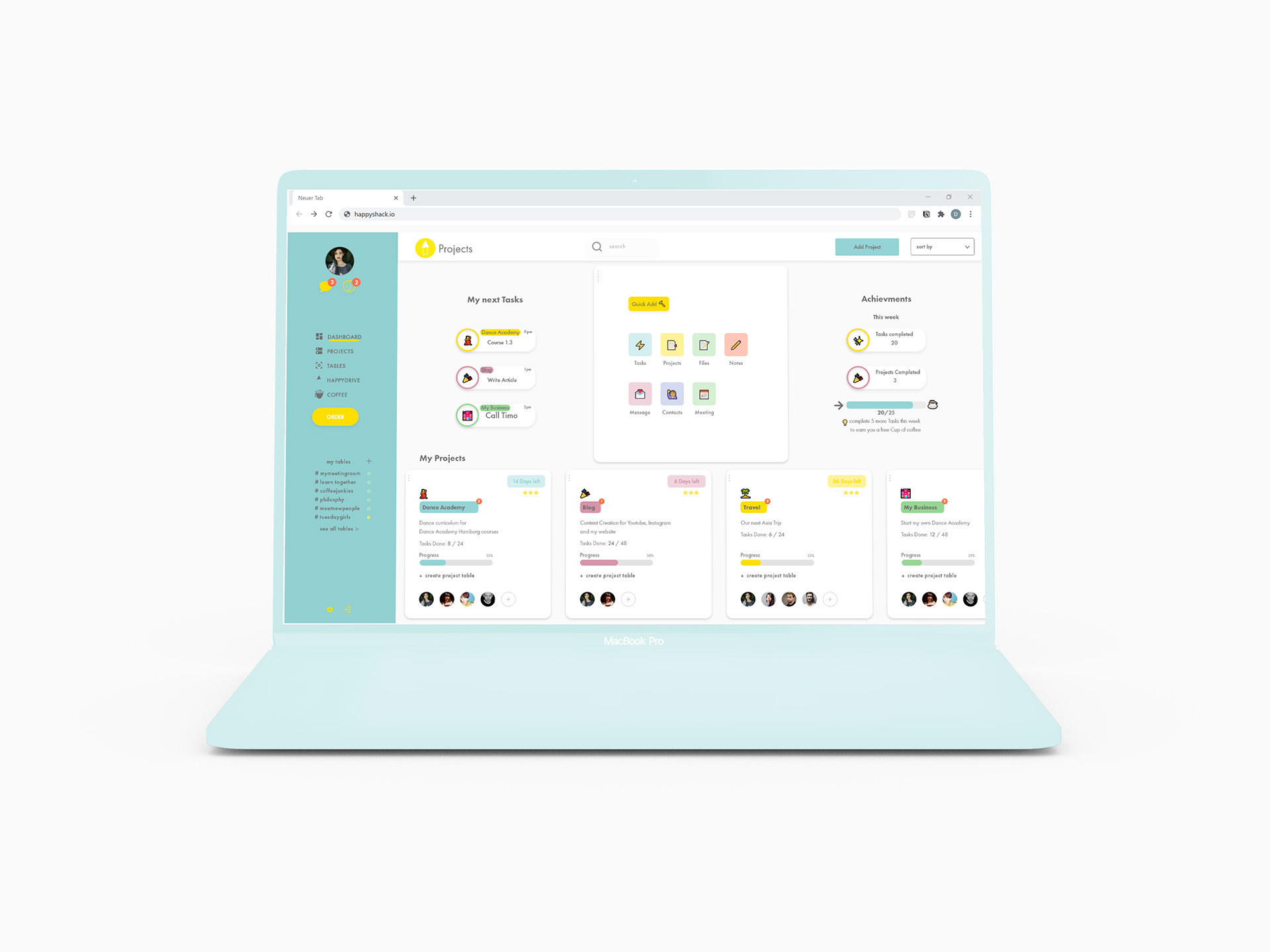
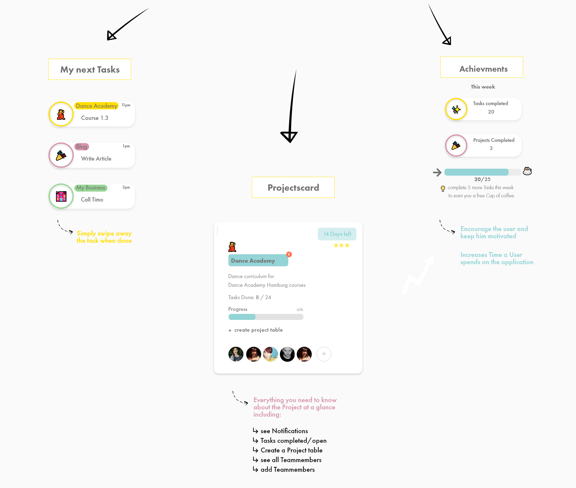
Project Management 📁
made easy everything under one shack.


Happydrive 🌈 ☁️
A cloud based drive to give the users all the data and information they need and want into their fingertips.